godaddy
New Member
ICANN Accredited Registrar
Domain Marketplace
Domain Broker
Hosting Provider
ICA Member
ISO 27001
- Joined
- Jan 26, 2009
- Messages
- 116
- Reaction score
- 8
This post was originally published on March 12, 2025, and was updated on March 4, 2026.
If you’re an entrepreneur and small business owner without professional design experience, it can be really intimidating to think about how to make your own logo. Where do you start? What tools do you need? How do you design your logo and make it look professional?
Think about how you instantly recognize McDonald’s golden arches or the Nike swoosh. That’s the power of a great logo.
It sticks in people’s minds and helps them remember you when they’re ready to buy. And when every business is trying to snag attention in a crowded market, a unique, eye-catching logo helps you stand out from all the other folks competing for that attention.
You could hire this out to a pro down the road, but if you’re working with a tight budget, learning how to make a custom logo yourself is well worth the effort.
Disclaimer: Third-party logos, names, and marks are registered trademarks of their respective owners. All rights reserved.
Get a unique AI-powered logo and more with Airo Plus.
Plus.
Planning and preparation are key elements of a successful business logo. Most business logos come from really understanding what makes your brand tick before you ever pick up a pencil or open any design software.
Think of it like building a house. You wouldn’t start putting up walls without a solid foundation, right? The same should hold true for your logo. Take some time to nail down your brand’s personality, values, and what makes you different from everyone else in your market.
Once you’ve defined your own business, check out what your competitors are doing with their logos. The point isn’t to copy them, but to make sure yours stands out. Create a mood board with designs that catch your eye. Jot down words that describe your brand’s vibe.
With all of this in mind, let’s explore the elements to consider when designing a business logo.
When you start designing a logo for your business, a fundamental first step is to understand your brand’s identity. This means you should first consider your business’s core values, mission, and vision, then identify your target audience and the message you want to convey.
A well-defined brand identity will help provide clearer direction for your logo design and ensure it accurately represents your business and resonates with your audience.
So, before diving into the aesthetics of the logo, such as color or typography, invest time in solidifying the essence of your brand. This step is pivotal to creating a logo that truly reflects your business.
Before we dig into actual design best practices, it’s essential to learn some logo design best practices. Here are a few important details to keep in mind when creating your own logo:
It’s important to take 20 to 30 minutes before you get started and set a really solid foundation for how you want to make your logo. Ask yourself these questions:
When you sit down to pick a symbol that represents your company, you have to be very clear on what image you’re trying to put out into the world.
What’s your brand’s personality?
Creating a custom logo is like choosing how to dress. You head to the office in business casual clothing, not your favorite pair of well-worn sweatpants. So, take a few moments to think about how your business would dress itself.
Now that you’re clear on the image you want to convey, think about what kind of visual best represents that.
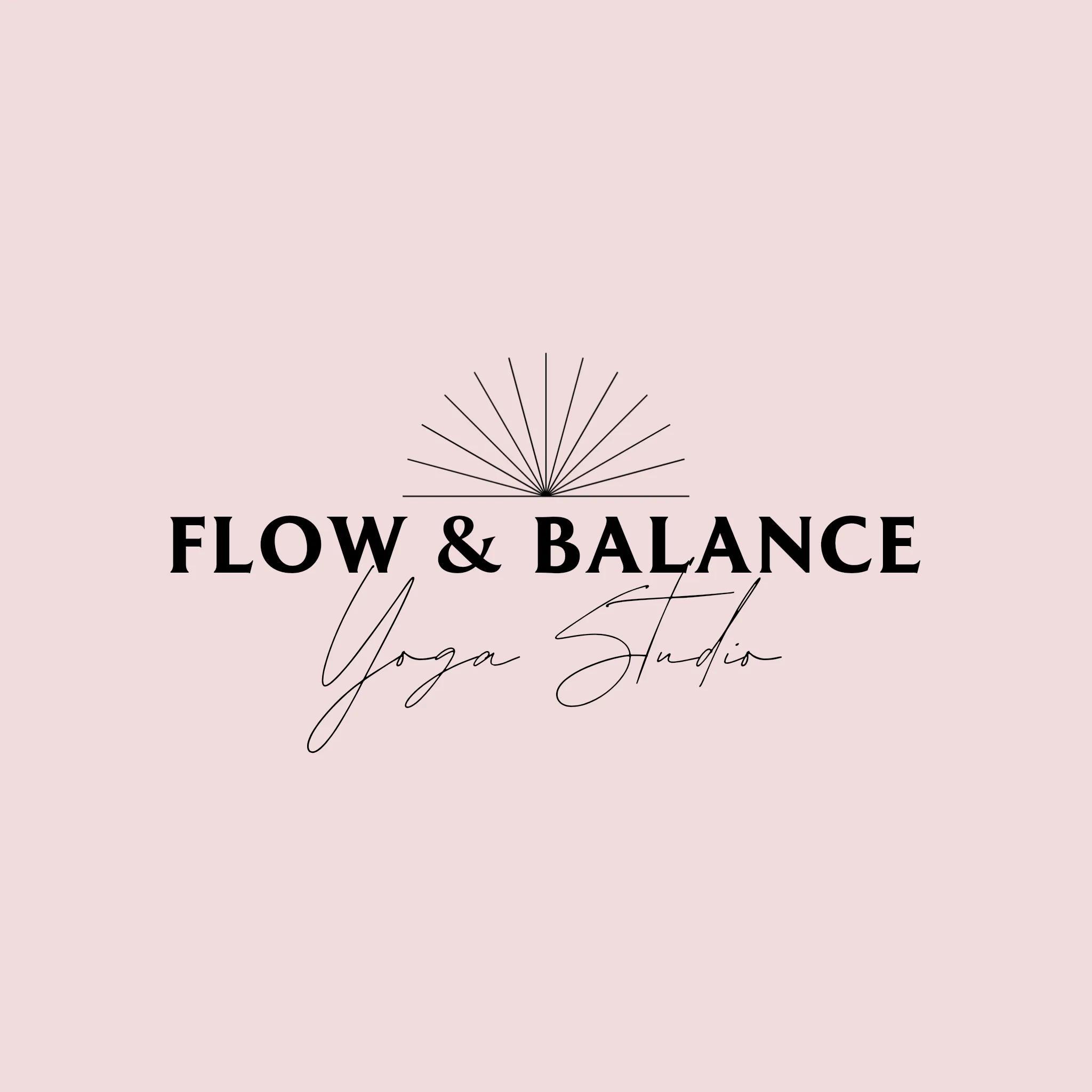
If you run a yoga studio, then a lotus flower or bubbling brook might fit the bill for the relaxing vibe you’re creating. If you’re a landscaper, maybe you want to use a leaf or a lawnmower in your design.
There’s no need to get too clever with this; obvious works. And don’t feel like you have to reinvent the wheel, either. Take a look at what other businesses in your industry are using to represent their brands visually.
Inspiration is everywhere.
Look closely at your business name. Is it really long with an accompanying tagline, or is it short? Since logos aren’t just used on websites, you need to plan for situations where space is limited, like the pocket of a T-shirt or the back of a baseball cap.
Printed promotional materials have different needs from digital ones.
If your logo name is long, it becomes a wide but short rectangle. What if you need it to fit into a square space?
Consider variations of your design where the wording is stacked to fit well in these applications.
You need to be super practical here. Is your logo going to be on a billboard? Or lapel pins? Or both? Reviewing wireframe design examples can help you visualize different sizes and placements.
Keep your logo as simple as possible so it’s recognizable from a distance or up close. Big or small.
And if wording needs to be included, make sure the font is readable at all sizes. Display fonts, such as fancy scripts, can be hard to read at small sizes.
When you’re preparing to create your logo, it’s a good idea to look at the logos of other companies that are in the same business category as you. This can give you a sense of what styles are popular and what might resonate with your customers.
However, it’s important to remember that your logo needs to be unique to your company; you don’t want to copy someone else’s design. Instead, use what you learn from looking at other logos as inspiration to help you come up with your own original design.
Now that you’ve laid the groundwork by understanding your brand identity, defining your target audience, and gathering inspiration through brainstorming, let’s transform all those ideas into a tangible design.
Learning how to design a logo that truly represents your brand is an exciting journey where strategy meets creativity. The key is to stay focused on the research you did earlier while allowing yourself the creative freedom to explore different design directions.
With your solid foundation of preparation work, you’re ready to dive into the specific design elements that will make your logo uniquely yours. Let’s explore how to combine these elements effectively to create a logo that not only looks good but also tells your brand’s story at a glance.
When learning how to design a logo that truly represents your brand, one of the most crucial decisions is choosing the right style.
Your logo style is more than “just aesthetics” – it’s a visual language that communicates your brand’s personality and values to potential customers. Whether you’re creating a logotype for a startup or refreshing an existing brand, your style choice will set the tone for how people perceive your business.
Logo styles are basically different voices for your brand. So, if you’re aiming for nostalgia or a sense of timelessness, a vintage/retro style can capture that charm perfectly. Perhaps you’re looking to project innovation and forward-thinking – in this case, a modern/contemporary or geometric style can communicate sleek professionalism and cutting-edge relevance.
The key to designing a good logo is matching your style with your brand’s core message.
Let’s explore some popular logo styles and when they might be right for your brand.
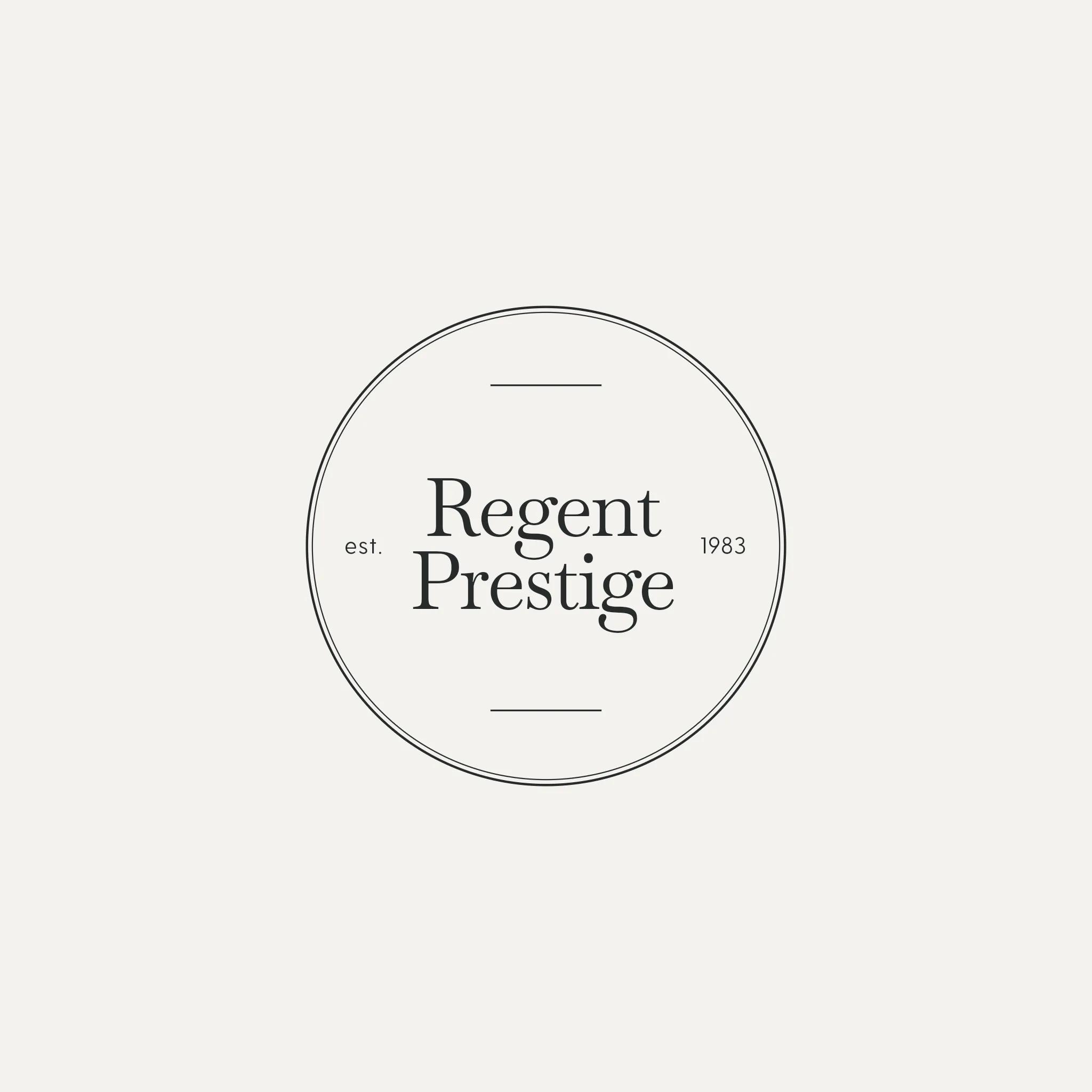
Minimalistic logos remove unnecessary elements to focus on what’s essential. They use clean lines, simple shapes, and plenty of white space to create a sophisticated and modern feel.
Minimalist designs are easily recognizable. And, they’re highly versatile, making them perfect for businesses that want to appear refined and professional.
This style works particularly well for:
A minimalistic logo can communicate elegance and clarity while ensuring your brand remains memorable. It’s especially effective when you need your logo to work across multiple platforms and sizes, from a tiny app icon to a billboard.
Examples of minimalistic logos:

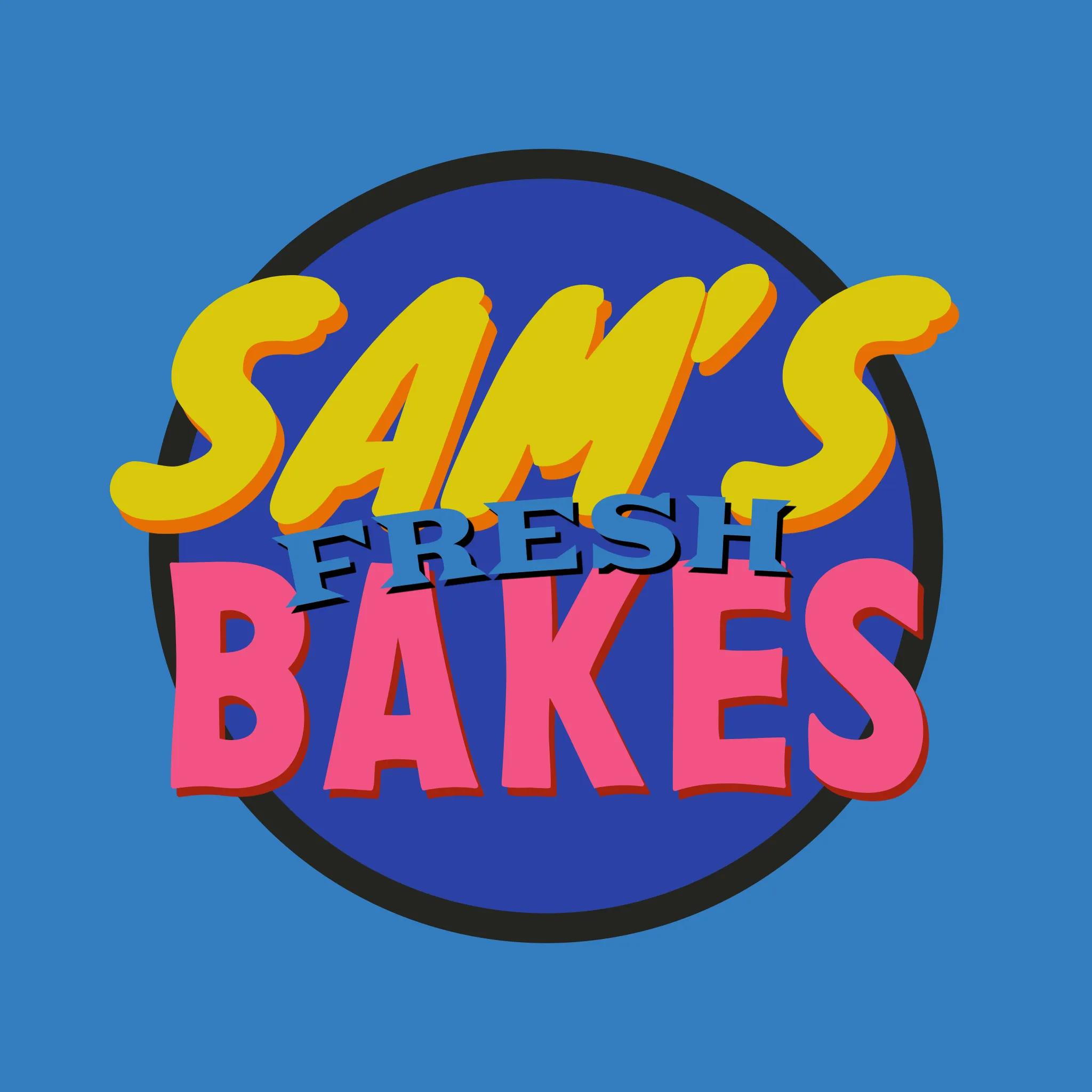
Modern and contemporary logos reflect current design trends while maintaining a forward-thinking approach. These logos often feature clean lines, bold colors, and innovative combinations of geometric shapes.
They can incorporate gradients, overlapping elements, and dynamic compositions that feel fresh and current.
This style is ideal for:
Modern logos excel at communicating innovation and staying current with design trends while maintaining professionalism and approachability.
Examples of modern/contemporary logos:

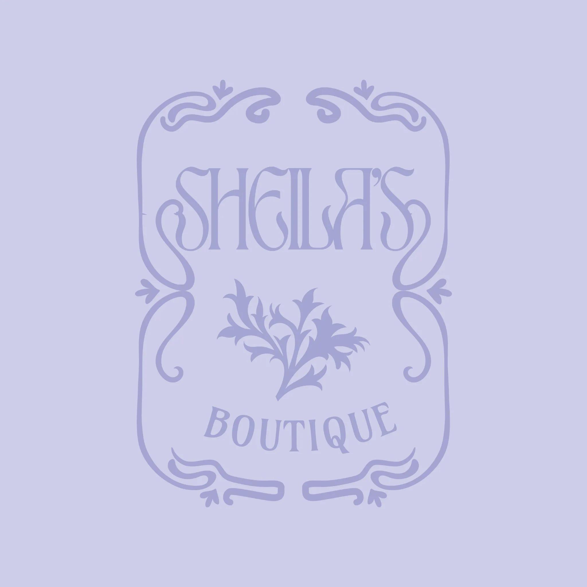
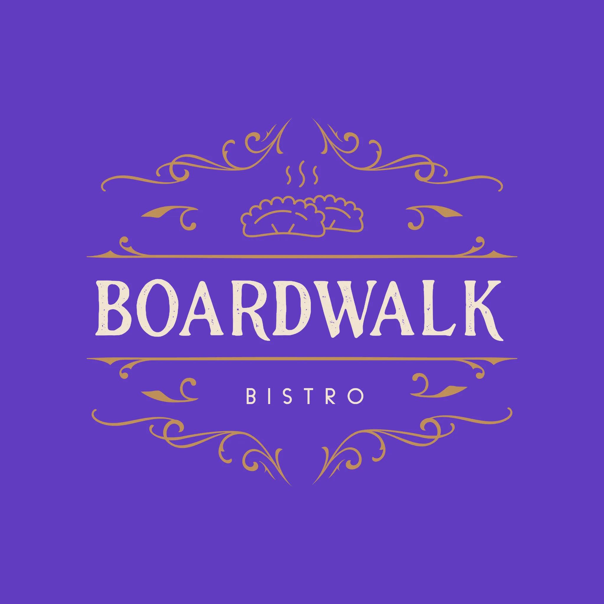
Vintage and retro logos draw inspiration from past design eras by incorporating classic typography, ornate details, and traditional emblems. These logos often feature weathered textures, badge-like shapes, and decorative elements that evoke a sense of history and authenticity.
This style works well for:
A vintage logo style can effectively communicate tradition, craftsmanship, and timeless quality, making it perfect for brands that want to emphasize their history or traditional values.
Examples of vintage/retro logos:

Hand-drawn logos feature organic, imperfect lines and custom lettering that add a personal, artistic touch to your brand. This style can range from simple sketches to elaborate illustrations, all unified by their authentic, human feel.
These logos often incorporate natural textures and flowing lines that create a sense of warmth and approachability.
This style is perfect for:
Hand-drawn logos excel at communicating authenticity, creativity, and a personal touch, making them ideal for brands that want to emphasize their human side.
Examples of hand-drawn logos:

Geometric logos use precise shapes and mathematical principles to create clean, structured designs. These logos often feature perfect circles, squares, triangles, and other geometric forms arranged in visually striking compositions.
The style emphasizes symmetry, proportion, and careful attention to spatial relationships. It’s particularly effective for:
Geometric logos communicate precision, reliability, and mathematical beauty, making them perfect for brands that want to emphasize structure, organization, and technical expertise.
Examples of geometric logos:

Next, you’ll need to decide on the type of logo that you want. Logos tend to fall into distinct buckets, so let’s take a look at a handful of the types of logos typically used.
A brand mark is a symbol that represents a brand. These typically include real-world objects that symbolize your brand or convey your brand values or message. Apple’s logo is an example of a brand mark.
An abstract logo is a type of logo that uses geometric shapes, lines, and colors to represent a company or brand, rather than realistic or recognizable images. GoDaddy’s logo would be considered an abstract logo.
Wordmarks are what they sound like — text-based logos. While it sounds simple, executing it successfully can be more difficult and tends to perform better for established brands whose names are instantly recognizable. Coca-Cola is an example of a wordmark logo.
A mascot logo features an illustrated character that represents a brand. Mascots can be a fun way to appeal to audiences, especially younger ones, so think about your target audience if you’re considering this logo. Pringles uses a mascot in its company logo.
Emblem logos combine both text and image in a crest-style design. These tend to be ornate and lean more traditional than modern. Starbucks uses an emblem logo.
When you decide to create a unique, one-of-a-kind custom logo for yourself, but it’s simple and text-based, you’ll want to consider your font options. You can use a standard free font, or a paid font if you’re looking for a more unique option (Creative Market and Font Shop are a couple of great places to get affordable, custom fonts).
When choosing a font for your logo, you’ll want to first think about the type of font that fits your business. Consider what some of the fonts below convey:
Once you’ve selected your font, it’s time to think about how you want to arrange your logo. If you put the pieces on different layers, you can move things around easily to see what looks best.
You can also experiment with altering the text itself. You could try:
Start simple, then gradually introduce a new treatment if you need to emphasize or de-emphasize certain words in your logo design.
An example of a company that’s leveraging the “Combining items so they share a common letter or line” method (last bullet from above) is CNN. The CNN logo has combined the two “Ns” together so they share a common line. Fonts aren’t designed to do this naturally, so you know it was an intentional decision.
Color is a powerful tool. Research shows that people form a judgment about a product within 90 seconds, and that between 62% and 90% of that assessment is based on color alone.
When choosing a color (or colors), keep in mind that most logos are three colors or fewer. There are always exceptions, but for the most part, brands tend to use fewer colors. This is even more true in recent years, with a trend toward flat, minimalist design.
Think about the logos you see on a regular basis — Spotify, Facebook, Pinterest, etc. They’re all a single color.
Playing with color in your logo is super fun, but something to keep in mind is that you may sometimes be stuck with a grayscale version (typically for cost reasons—color is expensive).
You need your logo to stand on its own, whether it’s in color or not.
Don’t let the color do all the heavy lifting. Make sure that you’ve nailed down your design first, then add color. The point is that you want a recognizable brand, whether color is present or not.
With all that in mind, let’s take a look at what different logo colors mean.
Red signals energy, passion, and urgency. It grabs attention quickly and encourages action, making it popular with brands that want to feel bold and confident. Retail and entertainment companies often rely on red to create excitement and momentum. Netflix uses red in its logo to project intensity, drama, and bold storytelling, which helps it stand out instantly on screens across the world.

Other examples:


Orange blends enthusiasm, creativity, and friendliness. It feels playful without being overpowering, which makes it a strong choice for brands that want to appear innovative and accessible. Nickelodeon’s bright orange logo reflects imagination and fun, aligning perfectly with its entertainment-first identity and young audience.

Other examples:
Yellow represents optimism, warmth, and clarity. It’s highly visible and naturally uplifting, helping brands convey positivity and confidence. IKEA uses yellow in its logo to create a welcoming, energetic feel that mirrors its affordable, design-forward products and global appeal.

Other examples:


Green is tied to growth, balance, and sustainability. It often signals health, renewal, and environmental awareness, making it a natural fit for wellness and eco-conscious brands. Whole Foods Market uses green to emphasize freshness, transparency, and a connection to natural ingredients and responsible sourcing.

Other examples:

Blue communicates trust, stability, and professionalism. It is widely used across tech, finance, and healthcare because it builds credibility and feels dependable. Conversely, it can also be used to convey fun and retro-leaning design. PayPal’s blue logo reinforces security and reliability, supporting its role as a trusted platform for digital payments worldwide.

Other examples:
Purple conveys creativity, imagination, and a sense of premium quality. It has long been associated with luxury and originality. Twitch uses purple to highlight its creative community, bold personality, and position as a hub for interactive entertainment.

Other examples:

Black represents sophistication, authority, and modern simplicity. It creates a sleek, confident look that works especially well for luxury and fashion brands. Chanel’s black logo reinforces timeless elegance and high-end appeal.

Other examples:

White signals simplicity, clarity, and clean design. It is often used to create contrast or convey transparency and innovation. The white lettering in Sony’s logo highlights precision and minimalism, reinforcing the brand’s focus on streamlined technology and refined product design.

Other examples:

Once you’ve designed a logo for your business, it’s time to test it out. Here are some ideas for what you’ll want to test your logo on:
It’s important to design with multiple dimensions and sizes in mind. Using a vector file logo will help tremendously here, as it will keep your logo looking sharp at any size.
In addition to testing your logo on different product/content types, you’ll also want to test it on a variety of different colored backgrounds. Not every application for your logo will have a white background, so don’t build a logo contingent on that.
If you follow the above steps for how to create a logo, you’ll be off to a great start. However, there are a few more tips that can help ensure your success.
A great logo should be distinctive, so your business stands out and isn’t easily confused with other companies. It should also match what your business or brand does or stands for.
Logos also need to look good in different sizes, from tiny app icons to big billboards, and they shouldn’t be too complicated or detailed. And, a good logo should be versatile. This means it works well in different formats, like on a website, a t-shirt, or a business card, and it looks good in both color and black and white.
You’re going to use your logo across many marketing channels, probably in print as well as digitally. So take the time to show off your brand consistently, using the same messaging, imagery style, fonts, and colors.
This will instill trust in your customers and boost brand recognition.
If you get lax with this and start mixing in different colors or odd font treatments, it dilutes your brand and makes you look unprofessional. So keep it consistent.
Remember keeping things simple? This holds true for logo evolutions as well. If it’s too complex, it will be a pain to change later. So, try to keep just a few important elements intact, like the primary color and font. Then, if you need to upgrade it later, it can be done with just a few small tweaks, and the main identifying features remain intact.
Designing a logo takes time, creativity, and strategy, so it makes sense to protect it. When you’re done designing, trademark your logo so other businesses can’t use something too similar. A trademark helps establish ownership and adds long-term value to your brand.
Yep, even logo design has been transformed by artificial intelligence. Professional-quality logos are accessible to everyone. The best part? No design experience is required. With tools like GoDaddy’s logo maker, creating a unique brand identity is now as simple as answering a few questions about your business and style preferences.
Airo Plus
Logo is included with GoDaddy Airo Plus, and it uses AI to analyze your inputs and generate customized logo options tailored specifically to your brand.
Tell the software your business type, industry, and design preferences, and it can generate multiple professional logo variations for you to choose from.
For example, if you indicate you want a modern, minimalist style for your tech company, the AI will create sleek designs with appropriate typography and symbols.
With AI logo design tools like Airo Plus Logo, you can go from concept to having a completed logo in minutes rather than days or weeks.
Get a unique AI-powered logo and more with Airo Plus.
For those who prefer to leave it to the pros, GoDaddy’s Logo Design Service pairs you with experienced designers who can transform your vision into reality. Our designers work closely with you to understand your brand and create an affordable and unique logo that captures your business’s essence.
Whether you choose to design it yourself or work with our professionals, we provide all the tools and support you need to create a logo that makes your brand stand out. Plus, you’ll receive your logo in multiple formats, ensuring it looks perfect wherever you use it, from your website to your business cards and everything in between.
Here’s a quick overview of what makes a good business logo:
One way to create your own logo for free is by using a free logo maker, such as GoDaddy Logo Maker. With a free logo maker, you can make your logo from scratch and customize it to your liking. You can play around with different fonts, colors, shapes, and even icons. Once you’re happy with your design, you can download your new logo for free.
GoDaddy’s free logo designer tool includes 100s of free logo templates that you can use to inspire your logo design. Simply search for “logo” inside the GoDaddy Logo Maker tool to view all of the available logo templates. You can find templates for every niche, from construction logos to beauty logos.
There isn’t a standard size for a logo; however, you will need to consider where you’ll use it and base your sizing decisions accordingly. From a favicon to billboards, your logo should be flexible.
For a full breakdown on image size requirements on various platforms, check out our ultimate guide to social media image sizes.
The golden rule of logo design is simplicity. A strong logo is easy to recognize, easy to remember, and easy to use across different platforms. It should look just as good on a website favicon as it does on packaging or signage. Simple logos scale better, reproduce cleanly, and stay relevant longer. Focus on clarity, balance, and versatility so your design works everywhere your brand shows up.
Start with your brand basics, including your name, industry, audience, and personality. Then explore colors, fonts, and symbols that reflect that identity. If you want a fast, guided option, try GoDaddy’s AI-powered Logo Maker. It generates custom logo concepts based on your business details and style preferences, giving you polished designs you can edit, download, and use right away.
The post How to create a business logo in 2026: Logo design tips appeared first on GoDaddy Blog.
Continue reading...
If you’re an entrepreneur and small business owner without professional design experience, it can be really intimidating to think about how to make your own logo. Where do you start? What tools do you need? How do you design your logo and make it look professional?
Even though your logo is just a small image, it has a huge impact. It’s not just a pretty design; it’s the face of your brand that customers will see everywhere.
Think about how you instantly recognize McDonald’s golden arches or the Nike swoosh. That’s the power of a great logo.
It sticks in people’s minds and helps them remember you when they’re ready to buy. And when every business is trying to snag attention in a crowded market, a unique, eye-catching logo helps you stand out from all the other folks competing for that attention.
You could hire this out to a pro down the road, but if you’re working with a tight budget, learning how to make a custom logo yourself is well worth the effort.
Disclaimer: Third-party logos, names, and marks are registered trademarks of their respective owners. All rights reserved.
Get a unique AI-powered logo and more with Airo
Plus.Foundational steps to take before designing your logo
Planning and preparation are key elements of a successful business logo. Most business logos come from really understanding what makes your brand tick before you ever pick up a pencil or open any design software.
Think of it like building a house. You wouldn’t start putting up walls without a solid foundation, right? The same should hold true for your logo. Take some time to nail down your brand’s personality, values, and what makes you different from everyone else in your market.
Once you’ve defined your own business, check out what your competitors are doing with their logos. The point isn’t to copy them, but to make sure yours stands out. Create a mood board with designs that catch your eye. Jot down words that describe your brand’s vibe.
With all of this in mind, let’s explore the elements to consider when designing a business logo.
1. Understand your business and define your brand’s identity
When you start designing a logo for your business, a fundamental first step is to understand your brand’s identity. This means you should first consider your business’s core values, mission, and vision, then identify your target audience and the message you want to convey.
A well-defined brand identity will help provide clearer direction for your logo design and ensure it accurately represents your business and resonates with your audience.
So, before diving into the aesthetics of the logo, such as color or typography, invest time in solidifying the essence of your brand. This step is pivotal to creating a logo that truly reflects your business.
2. Best practices for DIY logo design
Before we dig into actual design best practices, it’s essential to learn some logo design best practices. Here are a few important details to keep in mind when creating your own logo:
- Make it legible and concise: Make sure your logo is easy to remember while still communicating your brand’s identity.
- Use a clear color palette: As a general rule, use no more than three colors, and make sure your logo also works in black and white.
- Use one to two fonts: To keep your logo recognizable, it’s recommended that you only use one or two fonts.
- Test different sizes: Your logo should look great on both a large sign and a small business card.
- Watch your balance and alignment: Make sure your design elements are properly aligned. If you’re using Photoshop, turn on Smart Guides and use the Align Panel to help with this. You don’t want to guess about where the center is on your design, so utilize tools to help you.
3. Brainstorm before starting to design your business logo
It’s important to take 20 to 30 minutes before you get started and set a really solid foundation for how you want to make your logo. Ask yourself these questions:
- What image are you trying to convey?
- How can you represent your brand image visually?
- What parts of your name and tagline are essential?
- Where will you be displaying your logo?
- What styles and designs are used in competitors’ business logos?
What image are you trying to convey?
When you sit down to pick a symbol that represents your company, you have to be very clear on what image you’re trying to put out into the world.
What’s your brand’s personality?
- If you are in a more serious field like accounting or financial services, then a cartoon character doesn’t make sense.
- If you sell children’s toys, however, then a cartoon character is a perfect fit.
Creating a custom logo is like choosing how to dress. You head to the office in business casual clothing, not your favorite pair of well-worn sweatpants. So, take a few moments to think about how your business would dress itself.
How can you represent your brand image visually?
Now that you’re clear on the image you want to convey, think about what kind of visual best represents that.
If you run a yoga studio, then a lotus flower or bubbling brook might fit the bill for the relaxing vibe you’re creating. If you’re a landscaper, maybe you want to use a leaf or a lawnmower in your design.
There’s no need to get too clever with this; obvious works. And don’t feel like you have to reinvent the wheel, either. Take a look at what other businesses in your industry are using to represent their brands visually.
Inspiration is everywhere.
What parts of your name and tagline are essential?
Look closely at your business name. Is it really long with an accompanying tagline, or is it short? Since logos aren’t just used on websites, you need to plan for situations where space is limited, like the pocket of a T-shirt or the back of a baseball cap.
Printed promotional materials have different needs from digital ones.
If your logo name is long, it becomes a wide but short rectangle. What if you need it to fit into a square space?
Consider variations of your design where the wording is stacked to fit well in these applications.
Where will you be displaying your logo?
You need to be super practical here. Is your logo going to be on a billboard? Or lapel pins? Or both? Reviewing wireframe design examples can help you visualize different sizes and placements.
Keep your logo as simple as possible so it’s recognizable from a distance or up close. Big or small.
And if wording needs to be included, make sure the font is readable at all sizes. Display fonts, such as fancy scripts, can be hard to read at small sizes.
What styles and designs are used in competitors’ business logos?
When you’re preparing to create your logo, it’s a good idea to look at the logos of other companies that are in the same business category as you. This can give you a sense of what styles are popular and what might resonate with your customers.
However, it’s important to remember that your logo needs to be unique to your company; you don’t want to copy someone else’s design. Instead, use what you learn from looking at other logos as inspiration to help you come up with your own original design.
Steps to bring your logo design to life
Now that you’ve laid the groundwork by understanding your brand identity, defining your target audience, and gathering inspiration through brainstorming, let’s transform all those ideas into a tangible design.
Learning how to design a logo that truly represents your brand is an exciting journey where strategy meets creativity. The key is to stay focused on the research you did earlier while allowing yourself the creative freedom to explore different design directions.
With your solid foundation of preparation work, you’re ready to dive into the specific design elements that will make your logo uniquely yours. Let’s explore how to combine these elements effectively to create a logo that not only looks good but also tells your brand’s story at a glance.
1. Pick a logo style that resonates with your brand
When learning how to design a logo that truly represents your brand, one of the most crucial decisions is choosing the right style.
Your logo style is more than “just aesthetics” – it’s a visual language that communicates your brand’s personality and values to potential customers. Whether you’re creating a logotype for a startup or refreshing an existing brand, your style choice will set the tone for how people perceive your business.
Logo styles are basically different voices for your brand. So, if you’re aiming for nostalgia or a sense of timelessness, a vintage/retro style can capture that charm perfectly. Perhaps you’re looking to project innovation and forward-thinking – in this case, a modern/contemporary or geometric style can communicate sleek professionalism and cutting-edge relevance.
The key to designing a good logo is matching your style with your brand’s core message.
Let’s explore some popular logo styles and when they might be right for your brand.
Minimalistic
Minimalistic logos remove unnecessary elements to focus on what’s essential. They use clean lines, simple shapes, and plenty of white space to create a sophisticated and modern feel.
Minimalist designs are easily recognizable. And, they’re highly versatile, making them perfect for businesses that want to appear refined and professional.
This style works particularly well for:
- Tech companies and startups
- Modern retail brands
- Professional services
- Luxury products
- Digital platforms
A minimalistic logo can communicate elegance and clarity while ensuring your brand remains memorable. It’s especially effective when you need your logo to work across multiple platforms and sizes, from a tiny app icon to a billboard.
Examples of minimalistic logos:
- Nike’s swoosh
- Apple’s apple silhouette
- McDonald’s golden arches
- Target’s bullseye
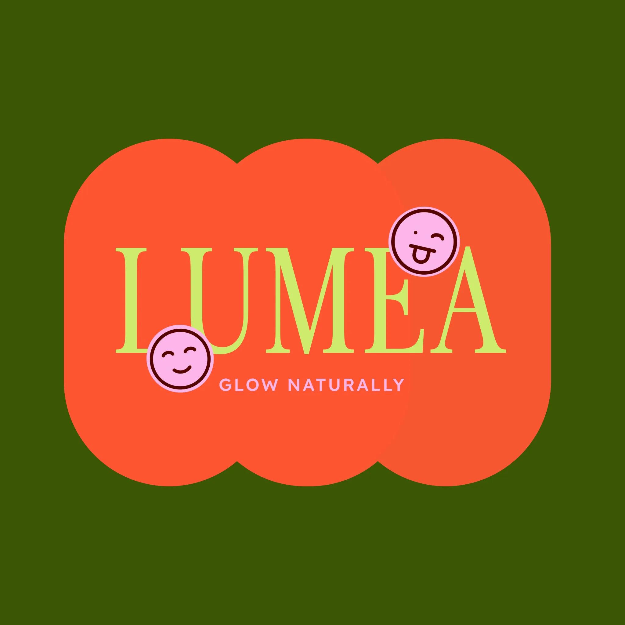
Modern/contemporary
Modern and contemporary logos reflect current design trends while maintaining a forward-thinking approach. These logos often feature clean lines, bold colors, and innovative combinations of geometric shapes.
They can incorporate gradients, overlapping elements, and dynamic compositions that feel fresh and current.
This style is ideal for:
- Technology companies
- Digital services
- Creative agencies
- Modern restaurants
- Forward-thinking brands
Modern logos excel at communicating innovation and staying current with design trends while maintaining professionalism and approachability.
Examples of modern/contemporary logos:
- Google’s colorful wordmark
- Spotify’s three curved lines
- Airbnb’s “Bélo” symbol
- Uber’s current wordmark and icon
- Adobe’s clean “A” symbol
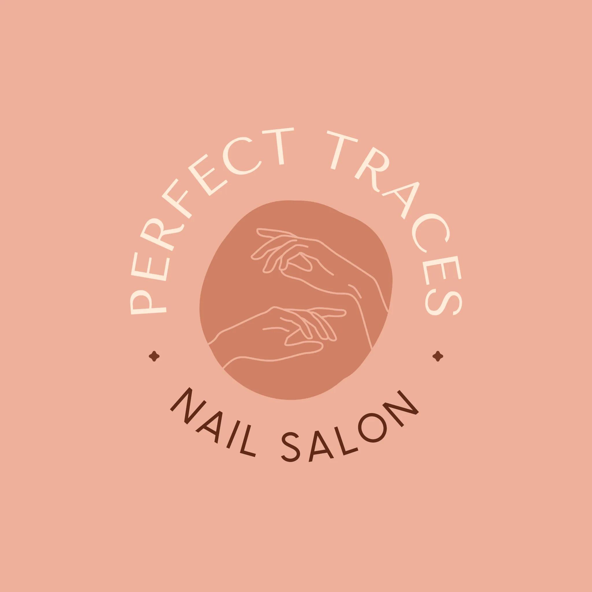
Vintage/retro
Vintage and retro logos draw inspiration from past design eras by incorporating classic typography, ornate details, and traditional emblems. These logos often feature weathered textures, badge-like shapes, and decorative elements that evoke a sense of history and authenticity.
This style works well for:
- Craft breweries and distilleries
- Artisanal food products
- Traditional barbershops
- Coffee shops
- Heritage brands
A vintage logo style can effectively communicate tradition, craftsmanship, and timeless quality, making it perfect for brands that want to emphasize their history or traditional values.
Examples of vintage/retro logos:
- Levi’s
- Jack Daniel’s
- Smith & Wesson
- Harley-Davidson
- Campbell’s Soup
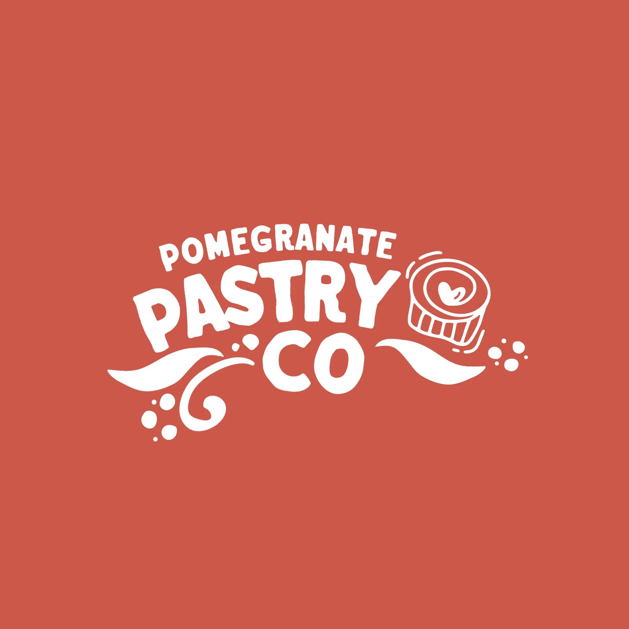
Hand-drawn
Hand-drawn logos feature organic, imperfect lines and custom lettering that add a personal, artistic touch to your brand. This style can range from simple sketches to elaborate illustrations, all unified by their authentic, human feel.
These logos often incorporate natural textures and flowing lines that create a sense of warmth and approachability.
This style is perfect for:
- Artists and craftspeople
- Children’s brands
- Organic products
- Local businesses
- Creative services
Hand-drawn logos excel at communicating authenticity, creativity, and a personal touch, making them ideal for brands that want to emphasize their human side.
Examples of hand-drawn logos:
- Disney’s signature-style wordmark
- Sharpie’s marker-style lettering
- Johnson & Johnson’s script
- Kellogg’s signature
- Coca-Cola’s flowing script
Geometric
Geometric logos use precise shapes and mathematical principles to create clean, structured designs. These logos often feature perfect circles, squares, triangles, and other geometric forms arranged in visually striking compositions.
The style emphasizes symmetry, proportion, and careful attention to spatial relationships. It’s particularly effective for:
- Architecture firms
- Engineering companies
- Software developers
- Financial institutions
- Modern design brands
Geometric logos communicate precision, reliability, and mathematical beauty, making them perfect for brands that want to emphasize structure, organization, and technical expertise.
Examples of geometric logos:
- Microsoft Windows’ four-square window
- Chase Bank’s octagon
- Google Drive’s triangle
- Mitsubishi’s three-diamond mark
- Adidas’ three stripes forming a triangle/mountain shape
2. Choose the type of logo you want
Next, you’ll need to decide on the type of logo that you want. Logos tend to fall into distinct buckets, so let’s take a look at a handful of the types of logos typically used.
- Brand mark
- Abstract logo
- Wordmark
- Mascots
- Emblems/badge logo
Brand mark
A brand mark is a symbol that represents a brand. These typically include real-world objects that symbolize your brand or convey your brand values or message. Apple’s logo is an example of a brand mark.
Abstract logo
An abstract logo is a type of logo that uses geometric shapes, lines, and colors to represent a company or brand, rather than realistic or recognizable images. GoDaddy’s logo would be considered an abstract logo.
Wordmarks
Wordmarks are what they sound like — text-based logos. While it sounds simple, executing it successfully can be more difficult and tends to perform better for established brands whose names are instantly recognizable. Coca-Cola is an example of a wordmark logo.
Mascots
A mascot logo features an illustrated character that represents a brand. Mascots can be a fun way to appeal to audiences, especially younger ones, so think about your target audience if you’re considering this logo. Pringles uses a mascot in its company logo.
Emblems/badge logo
Emblem logos combine both text and image in a crest-style design. These tend to be ornate and lean more traditional than modern. Starbucks uses an emblem logo.
3. Pick a font for your custom logo
When you decide to create a unique, one-of-a-kind custom logo for yourself, but it’s simple and text-based, you’ll want to consider your font options. You can use a standard free font, or a paid font if you’re looking for a more unique option (Creative Market and Font Shop are a couple of great places to get affordable, custom fonts).
When choosing a font for your logo, you’ll want to first think about the type of font that fits your business. Consider what some of the fonts below convey:
- Serif: Classic, refined, traditional.
- Sans-Serif: Modern, clean, simple.
- Slab serifs: Vintage, rustic.
- Script: Refined, elegant.
- Handwritten: Bespoke, custom, casual.
- Display (includes fonts like a typewriter, novelty, etc.): Funky, unusual.
Once you’ve selected your font, it’s time to think about how you want to arrange your logo. If you put the pieces on different layers, you can move things around easily to see what looks best.
You can also experiment with altering the text itself. You could try:
- Thin and thick versions of the font.
- Bold or italic versions of the font.
- Uppercase.
- Lowercase.
- Drop-shadows.
- Outlines (called “stroke”).
- Stacking words creatively.
- Overlapping letters.
- Staggering letters.
- Spacing out the letters.
- Pushing letters very close together.
- Combining items so they share a common letter or line.
Start simple, then gradually introduce a new treatment if you need to emphasize or de-emphasize certain words in your logo design.
An example of a company that’s leveraging the “Combining items so they share a common letter or line” method (last bullet from above) is CNN. The CNN logo has combined the two “Ns” together so they share a common line. Fonts aren’t designed to do this naturally, so you know it was an intentional decision.
4. Choose the colors of your logo
Color is a powerful tool. Research shows that people form a judgment about a product within 90 seconds, and that between 62% and 90% of that assessment is based on color alone.
When choosing a color (or colors), keep in mind that most logos are three colors or fewer. There are always exceptions, but for the most part, brands tend to use fewer colors. This is even more true in recent years, with a trend toward flat, minimalist design.
Think about the logos you see on a regular basis — Spotify, Facebook, Pinterest, etc. They’re all a single color.
Playing with color in your logo is super fun, but something to keep in mind is that you may sometimes be stuck with a grayscale version (typically for cost reasons—color is expensive).
You need your logo to stand on its own, whether it’s in color or not.
Don’t let the color do all the heavy lifting. Make sure that you’ve nailed down your design first, then add color. The point is that you want a recognizable brand, whether color is present or not.
With all that in mind, let’s take a look at what different logo colors mean.
Red logos
Red signals energy, passion, and urgency. It grabs attention quickly and encourages action, making it popular with brands that want to feel bold and confident. Retail and entertainment companies often rely on red to create excitement and momentum. Netflix uses red in its logo to project intensity, drama, and bold storytelling, which helps it stand out instantly on screens across the world.
Other examples:
Orange logos
Orange blends enthusiasm, creativity, and friendliness. It feels playful without being overpowering, which makes it a strong choice for brands that want to appear innovative and accessible. Nickelodeon’s bright orange logo reflects imagination and fun, aligning perfectly with its entertainment-first identity and young audience.
Other examples:
Yellow logos
Yellow represents optimism, warmth, and clarity. It’s highly visible and naturally uplifting, helping brands convey positivity and confidence. IKEA uses yellow in its logo to create a welcoming, energetic feel that mirrors its affordable, design-forward products and global appeal.
Other examples:
Green logos
Green is tied to growth, balance, and sustainability. It often signals health, renewal, and environmental awareness, making it a natural fit for wellness and eco-conscious brands. Whole Foods Market uses green to emphasize freshness, transparency, and a connection to natural ingredients and responsible sourcing.
Other examples:
Blue logos
Blue communicates trust, stability, and professionalism. It is widely used across tech, finance, and healthcare because it builds credibility and feels dependable. Conversely, it can also be used to convey fun and retro-leaning design. PayPal’s blue logo reinforces security and reliability, supporting its role as a trusted platform for digital payments worldwide.
Other examples:
Purple logos
Purple conveys creativity, imagination, and a sense of premium quality. It has long been associated with luxury and originality. Twitch uses purple to highlight its creative community, bold personality, and position as a hub for interactive entertainment.
Other examples:
Black logos
Black represents sophistication, authority, and modern simplicity. It creates a sleek, confident look that works especially well for luxury and fashion brands. Chanel’s black logo reinforces timeless elegance and high-end appeal.
Other examples:
White logos
White signals simplicity, clarity, and clean design. It is often used to create contrast or convey transparency and innovation. The white lettering in Sony’s logo highlights precision and minimalism, reinforcing the brand’s focus on streamlined technology and refined product design.
Other examples:
5. Experiment and test with your logo
Once you’ve designed a logo for your business, it’s time to test it out. Here are some ideas for what you’ll want to test your logo on:
- Business cards
- Stationery/invoices/receipts
- Store signs/billboards
- Favicon
- Digital display (social media, website, mobile devices, POS terminals, etc.)
- T-shirts, hats, mugs, etc.
It’s important to design with multiple dimensions and sizes in mind. Using a vector file logo will help tremendously here, as it will keep your logo looking sharp at any size.
In addition to testing your logo on different product/content types, you’ll also want to test it on a variety of different colored backgrounds. Not every application for your logo will have a white background, so don’t build a logo contingent on that.
Final design tips for making a custom logo
If you follow the above steps for how to create a logo, you’ll be off to a great start. However, there are a few more tips that can help ensure your success.
How to make a good logo
A great logo should be distinctive, so your business stands out and isn’t easily confused with other companies. It should also match what your business or brand does or stands for.
Logos also need to look good in different sizes, from tiny app icons to big billboards, and they shouldn’t be too complicated or detailed. And, a good logo should be versatile. This means it works well in different formats, like on a website, a t-shirt, or a business card, and it looks good in both color and black and white.
Be consistent
You’re going to use your logo across many marketing channels, probably in print as well as digitally. So take the time to show off your brand consistently, using the same messaging, imagery style, fonts, and colors.
This will instill trust in your customers and boost brand recognition.
If you get lax with this and start mixing in different colors or odd font treatments, it dilutes your brand and makes you look unprofessional. So keep it consistent.
Create a design that can evolve easily
Remember keeping things simple? This holds true for logo evolutions as well. If it’s too complex, it will be a pain to change later. So, try to keep just a few important elements intact, like the primary color and font. Then, if you need to upgrade it later, it can be done with just a few small tweaks, and the main identifying features remain intact.
Trademark your work
Designing a logo takes time, creativity, and strategy, so it makes sense to protect it. When you’re done designing, trademark your logo so other businesses can’t use something too similar. A trademark helps establish ownership and adds long-term value to your brand.
Not a designer? Let AI design your logo
Yep, even logo design has been transformed by artificial intelligence. Professional-quality logos are accessible to everyone. The best part? No design experience is required. With tools like GoDaddy’s logo maker, creating a unique brand identity is now as simple as answering a few questions about your business and style preferences.
Airo Plus
Tell the software your business type, industry, and design preferences, and it can generate multiple professional logo variations for you to choose from.
For example, if you indicate you want a modern, minimalist style for your tech company, the AI will create sleek designs with appropriate typography and symbols.
With AI logo design tools like Airo Plus Logo, you can go from concept to having a completed logo in minutes rather than days or weeks.
Get a unique AI-powered logo and more with Airo
Plus.Need professional help?
For those who prefer to leave it to the pros, GoDaddy’s Logo Design Service pairs you with experienced designers who can transform your vision into reality. Our designers work closely with you to understand your brand and create an affordable and unique logo that captures your business’s essence.
Whether you choose to design it yourself or work with our professionals, we provide all the tools and support you need to create a logo that makes your brand stand out. Plus, you’ll receive your logo in multiple formats, ensuring it looks perfect wherever you use it, from your website to your business cards and everything in between.
FAQ for making a logo
What elements make a good logo?
Here’s a quick overview of what makes a good business logo:
- Your logo is memorable and unique.
- The design of your logo is balanced.
- The type of logo you’ve created fits your business.
- You can use your logo in a variety of formats.
- The colors used in your logo are appropriate.
- Your logo is future-proof for business expansion.
How can I create my own logo for free?
One way to create your own logo for free is by using a free logo maker, such as GoDaddy Logo Maker. With a free logo maker, you can make your logo from scratch and customize it to your liking. You can play around with different fonts, colors, shapes, and even icons. Once you’re happy with your design, you can download your new logo for free.
Where to find logo templates?
GoDaddy’s free logo designer tool includes 100s of free logo templates that you can use to inspire your logo design. Simply search for “logo” inside the GoDaddy Logo Maker tool to view all of the available logo templates. You can find templates for every niche, from construction logos to beauty logos.
What is the standard size for a logo?
There isn’t a standard size for a logo; however, you will need to consider where you’ll use it and base your sizing decisions accordingly. From a favicon to billboards, your logo should be flexible.
For a full breakdown on image size requirements on various platforms, check out our ultimate guide to social media image sizes.
What is the golden rule of logo design?
The golden rule of logo design is simplicity. A strong logo is easy to recognize, easy to remember, and easy to use across different platforms. It should look just as good on a website favicon as it does on packaging or signage. Simple logos scale better, reproduce cleanly, and stay relevant longer. Focus on clarity, balance, and versatility so your design works everywhere your brand shows up.
How do I generate a logo for my company?
Start with your brand basics, including your name, industry, audience, and personality. Then explore colors, fonts, and symbols that reflect that identity. If you want a fast, guided option, try GoDaddy’s AI-powered Logo Maker. It generates custom logo concepts based on your business details and style preferences, giving you polished designs you can edit, download, and use right away.
The post How to create a business logo in 2026: Logo design tips appeared first on GoDaddy Blog.
Continue reading...